Numeracy Skills
3. Reading & Interpreting Graphs and Charts
3.2. Pie Charts
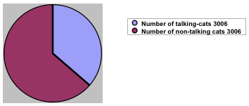
Pie charts are divided into sectors (‘slices’), each of which represent a specific quantity of data or ‘slice of the pie’.
For this reason, they are particularly useful for comparing a range of amounts or a specific amount, with a total one (ratio and proportion).
This is especially true when these are expressed as a percentage (360° = 100%).

Whilst simplicity renders such charts visually attractive, their inability to incorporate a range of data (here it has only been possible to present a particular piece of data from a specific year), means they are unpopular with those wishing to present their findings in a more comprehensive or scientific fashion.
When a more complex representation of data is required, we need look elsewhere.